Building interfaces#
Tecs provides retained layout without introducing a DOM or a second renderer. A UI node is an entity. tecs.ecs.ChildOf defines both its layout hierarchy and its transform hierarchy, while the existing rectangle, circle, image, sprite, and text producers keep drawing the result through the normal instanced GPU pipeline.
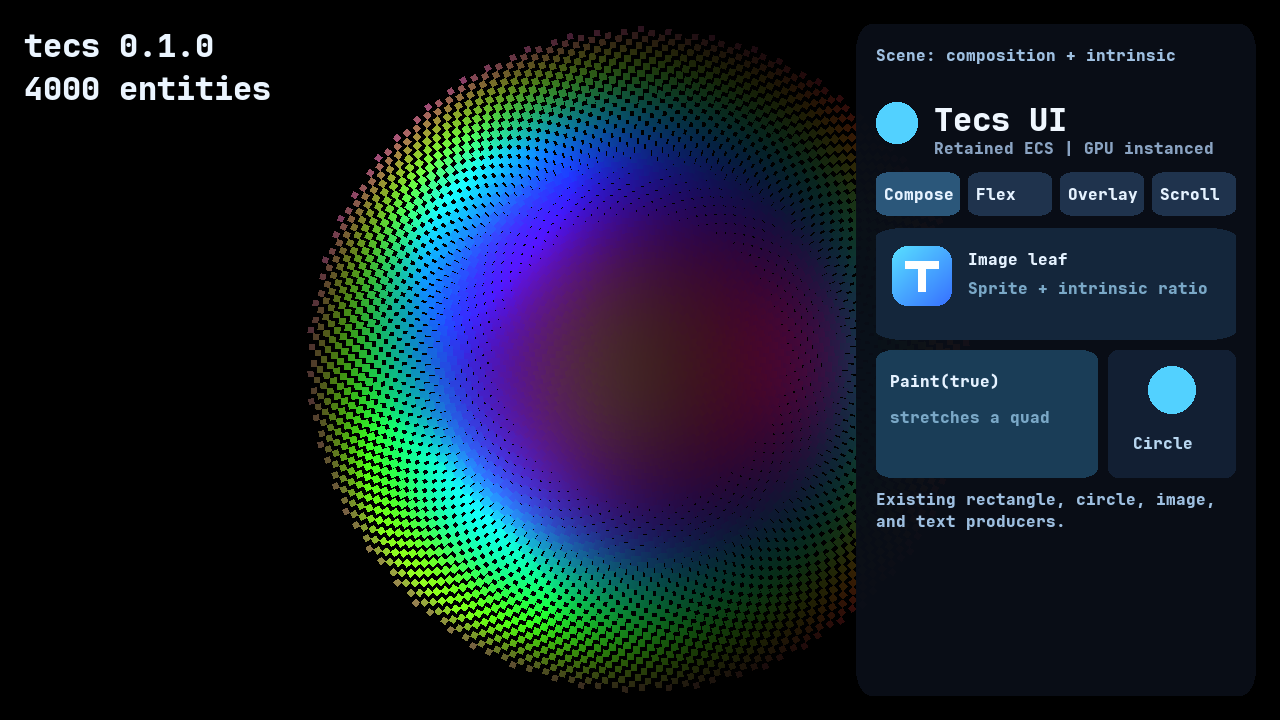
The Compose scene shows the central rule: Taffy sizes retained ECS nodes, while the existing image, rectangle, circle, and text producers draw their leaves.
The boundary is intentionally narrow:
tecs.ui.Stylesupplies layout properties.tecs.ui.Layoutreports the computed box.tecs.ui.Paintoptionally stretches an existing drawing leaf to that box.tecs.ui.Intrinsiclets text, images, and custom leaves contribute their natural size.tecs.ui.Scrolloffsets descendants and assigns the existing renderer clip component.tecs.ui.Scrollbardrives a composed thumb; it is not a special renderer primitive.tecs.ui.Interactionopts a box into hit testing, focus, and activation.
Layout changes only dirty transforms whose computed results changed. Drawing components retain their normal batching, materials, dirty tracking, and GPU instancing.
Start with a complete screen UI#
Run the four-scene showcase from the repository root:
nupp task ex-uiThe animated sunflower field, colored lights, gradient badge and four tabs are ordinary Tecs entities. Choose Compose, Flex, Overlay, or Scroll; resize the window, click controls, or navigate with Tab and Enter. Close the window to stop. The full source is examples/nupp/ui.nupp.
For a smaller application, run nupp task ex-uistandalone. The centered panel is shown at the end of this guide. Both examples use the same layout, text and interaction APIs as a game. To open a particular showcase tab directly, use TECS_UI_SCENE=flex nupp task ex-ui; the other names are compose, overlay and scroll.
The following two blocks form one complete Nupp component module. The first contains retained entity composition: a full-window root, a panel, an ordinary rounded rectangle behind it, and an intrinsic text leaf.
module myui

local function spawnInterface(exclusive world: tecs.ecs.World, font: tecs.gfx.fonts.Font): nil
    const root = world:spawn(
        tecs.ui.Style({width = "100%", height = "100%",
            justifyContent = "center", alignItems = "center", padding = "24px"}),
        tecs.ui.Root()
    )
    const panel = world:spawn(
        tecs.ui.Style({width = 420, height = 240,
            flexDirection = "column", padding = 20, gap = 12}),
        tecs.ecs.ChildOf(root)
    )
    world:spawn(
        tecs.ui.Style({position = "absolute", inset = 0}),
        tecs.ui.Paint(true), tecs.ecs.RelativeTransform2D(0, 0, 0),
        tecs.gfx.Tint(0.035, 0.055, 0.09, 0.96),
        tecs.gfx.Material(tecs.gpu.materials.id("rounded"), 0.05),
        tecs.gfx.Renderable2D, tecs.ecs.ChildOf(panel)
    )
    world:spawn(
        tecs.ui.Style({maxWidth = "100%"}),
        tecs.ui.Intrinsic({source = "text", wrap = true}),
        tecs.ecs.RelativeTransform2D(0, 0, 1),
        tecs.gfx.Tint(0.94, 0.97, 1, 1),
        tecs.gfx.Text("This text and its panel are ordinary ECS entities.", font, 16),
        tecs.ecs.ChildOf(panel)
    )
end
Style supplies the required node, layout, transform and clip components. ChildOf supplies the relative transform. Explicit relative transforms above choose the drawing depth; empty ones in the recipes below make the hierarchy visible in the code.
Install from the application plugin#
Paste this setup block after spawnInterface. It installs text and UI separately and loads an alpha font for fixed-size UI text. The Rust host calls the exported constructor and drives the returned session.
local function gamePlugin(exclusive app: tecs.application.Application): nil
    tecs.gfx.text.install(app.world)
    tecs.ui.plugin(app, {wheelStep = 36})
    const font = assert(tecs.gfx.fonts.newTTF({
        source = tecs.files.assetPath("fonts/JetBrainsMono-ExtraBold.ttf"),
        name = "game-ui-16", size = 16, raster = "alpha"
    }))
    spawnInterface(app.world, font)
end

export function create(title: string?, width: integer?, height: integer?,
    debug: boolean?, maxFrames: integer?): tecs.host.Session
    return tecs.host.createWithPlugin(gamePlugin, title or "My game",
        width or 1280, height or 720, debug, maxFrames)
end
Getting started explains how to register a game component in nupp.lua. The repository's ex-ui and ex-uistandalone targets are complete manifest examples.
tecs.ui.plugin(app) configures layer 16 as a screen-space, unlit overlay. The forward lane keeps UI above the scene and after bloom. Repeated installation on the same world is harmless. An options table can override the layer, input layer, wheel distance and clip allocation range.
The application keeps screen roots' logical size and pixel density synchronized with the window. Percentage dimensions follow a resize without a game observer or per-frame system. World roots have two explicit contracts. A manually sized root preserves its authored extent for a world-space panel:
A camera-sized root follows the active camera and viewport. Its layout units are world units; zoom and rotation update its root transform:
Tests and manually constructed worlds can wire layout directly:
Call tecs.ui.resize(world, width, height, pixelDensity) when that viewport changes. world:update runs layout and interaction in RenderFirst.
Layout recipes#
Every recipe below belongs inside spawnInterface and attaches to the root created there. A layout container needs Style, RelativeTransform2D, and ChildOf. It needs no drawing component unless the container itself should be visible.
Anchor a panel to a corner#
The root is a row by default. justifyContent chooses the main-axis position and alignItems chooses the cross-axis position. This puts a fixed-width panel at the top right while its height follows its children:
const sidebar = world:spawn(
    tecs.ui.Style({
        width = 360,
        flexDirection = "column",
        gap = 12,
        padding = 16,
        margin = {left = "auto"},
    }),
    tecs.ecs.RelativeTransform2D(),
    tecs.ecs.ChildOf(root)
)
For a true overlay that takes no space from siblings, use absolute positioning:
const overlay = world:spawn(
    tecs.ui.Style({
        position = "absolute",
        width = 360,
        inset = {right = 24, top = 24, bottom = 24},
        flexDirection = "column",
        gap = 12,
    }),
    tecs.ecs.RelativeTransform2D(),
    tecs.ecs.ChildOf(root)
)
Build a horizontal toolbar#
const toolbar = world:spawn(
    tecs.ui.Style({
        width = "100%",
        height = 48,
        flexDirection = "row",
        alignItems = "center",
        gap = 8,
        padding = {left = 12, right = 12},
    }),
    tecs.ecs.RelativeTransform2D(),
    tecs.ecs.ChildOf(root)
)

for index = 1, 4 do
    world:spawn(
        tecs.ui.Style({width = 96, height = 32}),
        tecs.ecs.RelativeTransform2D(),
        tecs.ecs.ChildOf(toolbar)
    )
end
Divide remaining space between children#
flexGrow consumes space left on the container's main axis. This creates a fixed navigation column and a content area that fills the rest:
const body = world:spawn(
    tecs.ui.Style({width = "100%", flexGrow = 1, flexDirection = "row", gap = 16}),
    tecs.ecs.RelativeTransform2D(),
    tecs.ecs.ChildOf(root)
)

const navigation = world:spawn(
    tecs.ui.Style({width = 220, height = "100%"}),
    tecs.ecs.RelativeTransform2D(),
    tecs.ecs.ChildOf(body)
)

const contentArea = world:spawn(
    tecs.ui.Style({flexGrow = 1, height = "100%"}),
    tecs.ecs.RelativeTransform2D(),
    tecs.ecs.ChildOf(body)
)
Wrap cards into rows#
const cards = world:spawn(
    tecs.ui.Style({
        width = "100%",
        flexDirection = "row",
        flexWrap = "wrap",
        gap = 12,
    }),
    tecs.ecs.RelativeTransform2D(),
    tecs.ecs.ChildOf(root)
)

for index = 1, 12 do
    world:spawn(
        tecs.ui.Style({width = 180, height = 96}),
        tecs.ecs.RelativeTransform2D(),
        tecs.ecs.ChildOf(cards)
    )
end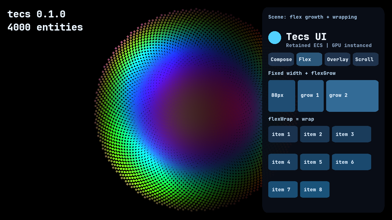
The Flex scene makes both behaviors measurable: the first row compares 88px, flexGrow = 1, and flexGrow = 2, while the cards below wrap at the panel edge.
Overlay a badge without affecting layout#
An absolute child is positioned relative to its retained parent and does not consume flex space:
world:spawn(
    tecs.ui.Style({
        position = "absolute",
        width = 20,
        height = 20,
        inset = {right = -6, top = -6},
    }),
    tecs.ui.Paint(true),
    tecs.ecs.RelativeTransform2D(0, 0, 5),
    tecs.gfx.Tint(1.0, 0.25, 0.2, 1.0),
    tecs.gfx.Material(tecs.gpu.materials.id("circle"), 0),
    tecs.gfx.Renderable2D,
    tecs.ecs.ChildOf(contentArea)
)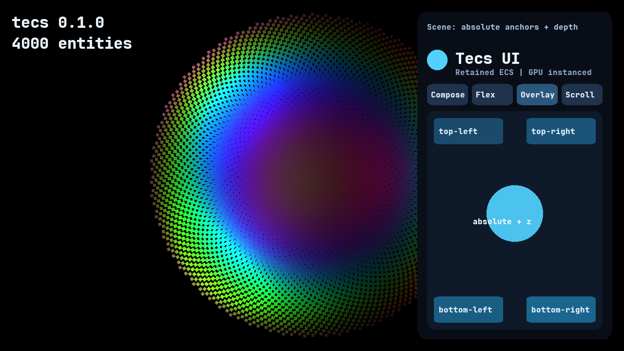
The Overlay scene shows that absolute children anchor to their retained parent without consuming flex space. The center circle and label also demonstrate that renderer depth remains independent from layout order.
Remove a subtree from layout#
Change display through getMut so the UI plugin sees the write:
const style = assert(world:getMut(sidebar, tecs.ui.Style))
style.style.display = "none"

-- Later:
const visible = assert(world:getMut(sidebar, tecs.ui.Style))
visible.style.display = "flex"
display = "none" removes the entity and its descendants from Taffy layout. It also hides drawing leaves and disables interaction for that subtree. The showcase changes this one style field when switching scenes; showing a scene restores its retained drawing and interaction state. Style changes made by an input observer take effect before that frame draws, so a newly revealed scene immediately receives its computed sizes and positions.
Compose visuals from ordinary entities#
A container normally has Style, RelativeTransform2D, and ChildOf. Put its visual on an absolute child. Paint(true) centers that child and copies the computed width and height into its relative transform scale.
The following entity snippets belong in spawnInterface, after the root is created.
const panel = world:spawn(
    tecs.ui.Style({
        width = 360,
        height = 520,
        flexDirection = "column",
        padding = 20,
        gap = 12,
    }),
    tecs.ecs.RelativeTransform2D(),
    tecs.ecs.ChildOf(root)
)

world:spawn(
    tecs.ui.Style({position = "absolute", inset = 0}),
    tecs.ui.Paint(true),
    tecs.ecs.RelativeTransform2D(0, 0, 0),
    tecs.gfx.Tint(0.035, 0.055, 0.09, 0.96),
    tecs.gfx.Material(tecs.gpu.materials.id("rounded"), 0.04),
    tecs.gfx.Renderable2D,
    tecs.ecs.ChildOf(panel)
)
The same pattern works with every drawing producer. A circle keeps the circle material, text keeps the glyph instance producer, and an image keeps its sprite. Add Intrinsic when a leaf should size itself instead of stretching:
world:spawn(
    tecs.ui.Style({width = 32, height = 32}),
    tecs.ui.Paint(true),
    tecs.ecs.RelativeTransform2D(0, 0, 2),
    tecs.gfx.Tint(0.32, 0.82, 1.0, 1.0),
    tecs.gfx.Material(tecs.gpu.materials.id("circle"), 0),
    tecs.gfx.Renderable2D,
    tecs.ecs.ChildOf(panel)
)

world:spawn(
    tecs.ui.Style({maxWidth = "100%"}),
    tecs.ui.Intrinsic({source = "text", wrap = true}),
    tecs.ecs.RelativeTransform2D(0, 0, 2),
    tecs.gfx.Tint(0.94, 0.97, 1.0, 1.0),
    tecs.gfx.Text("Composed, not replaced", font, 22),
    tecs.ecs.ChildOf(panel)
)
Draw a stretched rectangle#
There is no UI rectangle type. This is the normal renderer quad, stretched to the box computed for its parent:
const card = world:spawn(
    tecs.ui.Style({width = 280, height = 120}),
    tecs.ecs.RelativeTransform2D(),
    tecs.ecs.ChildOf(root)
)

world:spawn(
    tecs.ui.Style({position = "absolute", inset = 0}),
    tecs.ui.Paint(true),
    tecs.ecs.RelativeTransform2D(0, 0, 0),
    tecs.gfx.Tint(0.10, 0.17, 0.27, 1.0),
    tecs.gfx.Material(tecs.gpu.materials.id("rounded"), 0.08),
    tecs.gfx.Renderable2D,
    tecs.ecs.ChildOf(card)
)
Draw a circle at a fixed size#
world:spawn(
    tecs.ui.Style({width = 40, height = 40}),
    tecs.ui.Paint(true),
    tecs.ecs.RelativeTransform2D(0, 0, 1),
    tecs.gfx.Tint(0.32, 0.82, 1.0, 1.0),
    tecs.gfx.Material(tecs.gpu.materials.id("circle"), 0),
    tecs.gfx.Renderable2D,
    tecs.ecs.ChildOf(card)
)
Render crisp fixed-size UI text#
Load an alpha font at the displayed text size multiplied by pixel density. The same text component, atlas, producer, clipping, and instancing are used as SDF text. Choose the raster size for the intended display density:
const uiFont = assert(tecs.gfx.fonts.newTTF({
    source = tecs.files.assetPath("fonts/JetBrainsMono-ExtraBold.ttf"),
    name = "settings-ui-16",
    size = 16,
    raster = "alpha",
}))

world:spawn(
    tecs.ui.Style({maxWidth = "100%"}),
    tecs.ui.Intrinsic({source = "text"}),
    tecs.ecs.RelativeTransform2D(0, 0, 2),
    tecs.gfx.Tint(0.94, 0.97, 1.0, 1.0),
    tecs.gfx.Text("Video settings", uiFont, 16),
    tecs.ecs.ChildOf(card)
)
Use the default raster = "sdf" when the same font must animate through many scales or live in the world. Use separate name values when loading the same source in multiple sizes or raster modes because snapshots resolve fonts by name. At density 2, text drawn at 16 logical pixels uses a 32-pixel alpha raster. The demos refresh their font when the host reports a density change.
Wrap text to the available width#
world:spawn(
    tecs.ui.Style({width = "100%", maxWidth = 320}),
    tecs.ui.Intrinsic({source = "text", wrap = true}),
    tecs.ecs.RelativeTransform2D(0, 0, 2),
    tecs.gfx.Tint(0.72, 0.80, 0.90, 1.0),
    tecs.gfx.Text("This paragraph wraps when its parent becomes narrower.", uiFont, 16),
    tecs.ecs.ChildOf(card)
)
Load an image and preserve its aspect ratio#
Load the image through the Rust image service, then let its selected sprite region supply natural dimensions. This fixes the height at 64 logical pixels and derives the width from the image's aspect ratio:
const image = tecs.gfx.images.load(tecs.files.assetPath("demo/ui-badge.png"), "ui-badge")
world:spawn(
    tecs.ui.Style({height = 64}),
    tecs.ui.Intrinsic({source = "image"}), tecs.ui.Paint(true),
    tecs.ecs.RelativeTransform2D(0, 0, 2), tecs.gfx.Sprite(image),
    tecs.gfx.Tint(1, 1, 1, 1), tecs.gfx.Renderable2D,
    tecs.ecs.ChildOf(card)
)
The example badge is a PNG export of the original gradient SVG in assets/demo/ui-badge.svg. PNG and JPEG decode through the image service; convert vector artwork to a texture before loading it.
Give another leaf a natural size#
Use custom intrinsic metrics when a dedicated producer already knows its preferred size. Paint(true) below makes the ordinary rectangle consume those metrics:
world:spawn(
    tecs.ui.Style({maxWidth = "100%"}),
    tecs.ui.Intrinsic({source = "custom",
        width = 96,
        height = 28,
        minWidth = 48,
    }),
    tecs.ui.Paint(true),
    tecs.ecs.RelativeTransform2D(0, 0, 2),
    tecs.gfx.Tint(0.22, 0.56, 0.68, 1.0),
    tecs.gfx.Material(tecs.gpu.materials.id("rounded"), 0.12),
    tecs.gfx.Renderable2D,
    tecs.ecs.ChildOf(card)
)
tecs.ui.Intrinsic({source = "image"}) reads the selected sprite region's source dimensions from the image registry and preserves its aspect ratio when only one axis is constrained. tecs.ui.Intrinsic({source = "custom", width = 80, height = 24}) supplies cached metrics for another leaf producer. scale converts source units into UI units.
Text wrapping is a retained convergence step. Taffy chooses the available width, the UI plugin measures the wrapped height through tecs.gfx.text, and the tree is solved again when that measurement changes. No native callback enters Nupp inside Taffy and unchanged text is not reshaped each frame. The chosen width is retained in Text.wrapWidth, so the ordinary text instance producer draws the same lines that layout measured.
Do not stretch a container that owns layout children. Its transform scale would compose into every descendant. Stretch a dedicated absolute drawing child instead.
Style values and mutation#
Numbers and px strings are logical UI pixels; pixel density maps them to the render target. Percent strings are parent-relative, and auto selects automatic size:
tecs.ui.Style({
    width = "100%",
    minHeight = "120px",
    flexBasis = "auto",
    flexGrow = 1,
    margin = {left = "8px", right = "8px"},
})
Plain numbers remain the compact form of logical pixels, so padding = 24 and padding = "24px" are equivalent.
Changed styles are synchronized into the retained native tree. Window resizing changes the root's available space. Unchanged layout avoids native synchronization; computed boxes dirty ordinary transforms only when they change.
Supported properties are display, position, flexDirection, flexWrap, justifyContent, alignItems, alignContent, flexGrow, flexShrink, flexBasis, width, height, minimum and maximum dimensions, margin, padding, border, gap, rowGap, inset, and order. display also accepts block, implicit grid, and none; explicit grid track definitions are not exposed. See the Style.style contract for accepted values.
Styles are retained component data. Mutate through getMut so the plugin can synchronize the changed node into the retained layout tree:
Switch a responsive layout at a breakpoint#
Screen roots resize automatically, but a game may still want a deliberate layout change at a logical-width breakpoint. Cache the selected direction so getMut is called only when the breakpoint changes:
System recipes belong in gamePlugin, rather than inside spawnInterface. Keep the entity ids in plugin-local variables, assign them during plugin setup, and read them after the first commit. This abbreviated recipe assumes root and body are those retained ids:
local narrow = false

world:addSystem({
    name = "game.ResponsiveUi",
    phase = tecs.ecs.phases.Update,
    run = function(): nil
        if root == 0 or body == 0 then
            return
        end
        const rootValue = assert(world:get(root, tecs.ui.Root))
        const nextNarrow = rootValue.width < 720
        if nextNarrow ~= narrow then
            narrow = nextNarrow
            const style = assert(world:getMut(body, tecs.ui.Style))
            style.style.flexDirection = narrow and "column" or "row"
        end
    end,
})
Read a computed box#
Layout is engine-owned output. Read it after UI layout when another system needs the final logical dimensions:
world:addSystem({
    name = "game.ReadPanelLayout",
    phase = tecs.ecs.phases.Last,
    run = function(): nil
        const box = world:get(panel, tecs.ui.Layout)
        if box ~= nil then
            print(("panel is %.0f by %.0f"):format(box.width, box.height))
        end
    end,
})
Do not write Layout, Transform2D, or RelativeTransform2D to resize a retained node. Change its Style; the plugin owns the computed outputs.
Scroll and clip descendants#
Add Scroll to the viewport and make the larger content entity its child. Wheel input targets the deepest viewport under the pointer. The plugin clamps the offset, moves descendants after layout, intersects nested viewports, and writes ordinary tecs.gfx.Clip indices to drawing entities.
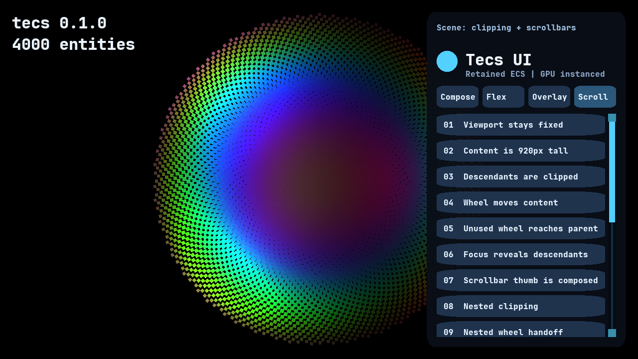
The Scroll scene labels the edge cases directly: fixed viewport size, clipped descendants, nested wheel handoff, focus reveal, and a scrollbar assembled from ordinary rectangle entities.
const viewport = world:spawn(
    tecs.ui.Style({
        width = "100%",
        height = 240,
    }),
    tecs.ui.Scroll(),
    tecs.ecs.RelativeTransform2D(),
    tecs.ecs.ChildOf(panel)
)

const content = world:spawn(
    tecs.ui.Style({
        width = "100%",
        height = 600, flexShrink = 0,
        flexDirection = "column",
        gap = 8,
    }),
    tecs.ecs.RelativeTransform2D(),
    tecs.ecs.ChildOf(viewport)
)
Populate the content with ordinary retained rows. The larger authored content height is what creates overflow:
local function spawnRow(label: string, tabIndex: integer): integer
    const row = world:spawn(
        tecs.ui.Style({width = "100%", height = 44, flexShrink = 0}),
        tecs.ui.Interaction({tabIndex = tabIndex}),
        tecs.ecs.RelativeTransform2D(),
        tecs.ecs.ChildOf(content)
    )
    world:spawn(
        tecs.ui.Style({position = "absolute", inset = 0}),
        tecs.ui.Paint(true),
        tecs.ecs.RelativeTransform2D(0, 0, 1),
        tecs.gfx.Tint(0.12, 0.20, 0.30, 1.0),
        tecs.gfx.Material(tecs.gpu.materials.id("rounded"), 0.08),
        tecs.gfx.Renderable2D,
        tecs.ecs.ChildOf(row)
    )
    world:spawn(
        tecs.ui.Style({position = "absolute", inset = {left = 12, top = 14}}),
        tecs.ui.Intrinsic({source = "text"}),
        tecs.ecs.RelativeTransform2D(0, 0, 2),
        tecs.gfx.Tint(0.9, 0.95, 1.0, 1.0),
        tecs.gfx.Text(label, font, 16),
        tecs.ecs.ChildOf(row)
    )
    return row
end

local lastRow: integer = 0
for index = 1, 20 do
    lastRow = spawnRow(("Item %02d"):format(index), index)
end
Programmatic scrolling writes Scroll.x or Scroll.y through getMut. Offsets clamp between zero and the retained content extent, including absolute descendants. contentWidth and contentHeight report the measured content dimensions. Negative requested offsets clamp to zero. Snapshots retain x and y; the derived content fields are rebuilt after load.
-- Scroll by a logical amount. The plugin clamps it during layout.
const scroll = assert(world:getMut(viewport, tecs.ui.Scroll))
scroll.y = scroll.y + 80

-- Or expose a particular descendant through every nested viewport.
tecs.ui.reveal(world, lastRow, "center")
Wheel movement starts at the deepest viewport and hands any unused distance to its ancestors. It follows the platform's configured scroll direction while leaving Input.wheelX and Input.wheelY available to directional gameplay bindings with their stable sign convention. Shift converts a vertical wheel into horizontal movement when the device reports no horizontal axis. Call tecs.ui.reveal(world, entity) to expose a descendant through every ancestor viewport. Focusing an entity does this automatically.
Taffy does not create or draw a scrollbar. It lays out the viewport and content. The UI system turns those retained measurements and Scroll.y into the thumb's RelativeTransform2D; the thumb itself uses the same ordinary material and instance components used elsewhere:
world:spawn(
    tecs.ui.Scrollbar({axis = "vertical", thickness = 6, inset = 2, minLength = 18}),
    tecs.ui.Interaction({focusable = false, draggable = true, order = 100}),
    tecs.ecs.RelativeTransform2D(0, 0, 10),
    tecs.gfx.Tint(0.4, 0.7, 0.9, 0.9),
    tecs.gfx.Material(tecs.gpu.materials.id("rounded"), 0.5),
    tecs.gfx.Renderable2D,
    tecs.ecs.ChildOf(viewport)
)
The thumb receives a zero length when its axis has no overflow. Horizontal scrollbars use the same component with "horizontal". A rail, border, end blocks, arrow controls, or grip marks are optional composed entities. The repository demo uses squared rectangles for a chunky retro skin; none of that appearance lives in Taffy or in the scrollbar component.
Here is a complete squared, blocky scrollbar skin. Only the middle entity carries Scrollbar; the track and end blocks are ordinary decoration:
world:spawn(
    tecs.ui.Style({
        position = "absolute",
        width = 14,
        inset = {right = 0, top = 0, bottom = 0},
    }),
    tecs.ui.Paint(true),
    tecs.ecs.RelativeTransform2D(0, 0, 8),
    tecs.gfx.Tint(0.05, 0.09, 0.14, 1.0),
    tecs.gfx.Material(tecs.gpu.materials.id("rounded"), 0),
    tecs.gfx.Renderable2D,
    tecs.ecs.ChildOf(viewport)
)

world:spawn(
    tecs.ui.Scrollbar({axis = "vertical", thickness = 12, inset = 16, minLength = 28}),
    tecs.ui.Interaction({focusable = false, draggable = true, order = 100}),
    tecs.ecs.RelativeTransform2D(0, 0, 10),
    tecs.gfx.Tint(0.32, 0.82, 1.0, 1.0),
    tecs.gfx.Material(tecs.gpu.materials.id("rounded"), 0),
    tecs.gfx.Renderable2D,
    tecs.ecs.ChildOf(viewport)
)

for _, top in ipairs({true, false}) do
    world:spawn(
        tecs.ui.Style({
            position = "absolute",
            width = 14,
            height = 14,
            inset = top and {right = 0, top = 0} or {right = 0, bottom = 0},
        }),
        tecs.ui.Paint(true),
        tecs.ecs.RelativeTransform2D(0, 0, 11),
        tecs.gfx.Tint(0.22, 0.56, 0.68, 1.0),
        tecs.gfx.Material(tecs.gpu.materials.id("rounded"), 0),
        tecs.gfx.Renderable2D,
        tecs.ecs.ChildOf(viewport)
    )
end
Observe clicks and keyboard activation#
Interaction adds clip-aware hit testing and transient InteractionState. Every mouse or touch identity captures independently. Releasing over the same target emits click followed by activate. A draggable interaction emits dragStart, dragMove, and dragEnd; losing its input layer emits dragCancel. Tab and Shift-Tab move focus; Enter and Space activate the focused control. Controller D-pad moves focus and its south button activates it.
const button = world:spawn(
    tecs.ui.Style({width = 180, height = 44, flexShrink = 0}),
    tecs.ui.Interaction({tabIndex = 1}),
    tecs.ecs.RelativeTransform2D(),
    tecs.ecs.ChildOf(content)
)

world:observe(button, tecs.ui.Event, function(event: tecs.ui.Event): nil
    if event.kind == "activate" then
        print("activated via", event.source)
    end
end)
Interaction makes the container selectable; it does not draw a button. Add ordinary visual and text children to complete it:
const buttonVisual = world:spawn(
    tecs.ui.Style({position = "absolute", inset = 0}),
    tecs.ui.Paint(true),
    tecs.ecs.RelativeTransform2D(0, 0, 1),
    tecs.gfx.Tint(0.12, 0.20, 0.30, 1.0),
    tecs.gfx.Material(tecs.gpu.materials.id("rounded"), 0.16),
    tecs.gfx.Renderable2D,
    tecs.ecs.ChildOf(button)
)

world:spawn(
    tecs.ui.Style({position = "absolute", inset = {left = 14, top = 13}}),
    tecs.ui.Intrinsic({source = "text"}),
    tecs.ecs.RelativeTransform2D(0, 0, 2),
    tecs.gfx.Tint(0.9, 0.95, 1.0, 1.0),
    tecs.gfx.Text("Apply", font, 16),
    tecs.ecs.ChildOf(button)
)
Events bubble through ChildOf. An observer can set event.consumed = true to stop ancestor delivery. Consuming a wheel event also suppresses default scrolling.
world:observe(panel, tecs.ui.Event, function(event: tecs.ui.Event): nil
    if event.kind == "activate" then
        print("panel saw activation from", event.target)
        event.consumed = true
    elseif event.kind == "wheel" and menuIsLocked then
        event.consumed = true
    end
end)
event.pointerId distinguishes simultaneous touches and event.pointerType reports "mouse" or "touch". Pointer movement and drag events put their movement in deltaX and deltaY.
Update hover, press, focus, and drag colors#
Keep the control and its drawing child as separate entities. The update system reads transient state from the control and dirties the GPU tint only when the selected color changes:
world:addSystem({
    name = "game.ButtonVisualState",
    phase = tecs.ecs.phases.Update,
    run = function(): nil
        const state = assert(world:get(button, tecs.ui.InteractionState))
        const tint = assert(world:get(buttonVisual, tecs.gfx.Tint))
        local r, g, b = 0.12, 0.20, 0.30
        if state.dragging or state.pressed then
            r, g, b = 0.14, 0.47, 0.62
        elseif state.hovered then
            r, g, b = 0.17, 0.34, 0.48
        elseif state.focused then
            r, g, b = 0.18, 0.29, 0.46
        end
        if tint.r ~= r or tint.g ~= g or tint.b ~= b then
            const changed = assert(world:getMut(buttonVisual, tecs.gfx.Tint))
            changed.r, changed.g, changed.b = r, g, b
        end
    end,
})
Register update systems from gamePlugin. Keep the spawned entity ids in plugin-local variables so those systems can read them after startup.
Handle dragging and simultaneous pointers#
const slider = world:spawn(
    tecs.ui.Style({width = 240, height = 32}),
    tecs.ui.Interaction({tabIndex = 2, draggable = true}),
    tecs.ecs.RelativeTransform2D(),
    tecs.ecs.ChildOf(panel)
)

local dragByPointer: {[string]: number} = {}
world:observe(slider, tecs.ui.Event, function(event: tecs.ui.Event): nil
    if event.kind == "dragStart" then
        dragByPointer[event.pointerId] = 0
    elseif event.kind == "dragMove" then
        dragByPointer[event.pointerId] =
            (dragByPointer[event.pointerId] or 0) + event.deltaX
    elseif event.kind == "dragEnd" or event.kind == "dragCancel" then
        dragByPointer[event.pointerId] = nil
    end
end)
Each touch and the mouse has its own pointerId, capture, and drag lifecycle. Do not use one global dragging boolean when a control needs to distinguish simultaneous touches.
Call tecs.ui.focus, tecs.ui.blur, and tecs.ui.focused for programmatic focus. A modal panel can carry tecs.ui.FocusScope and constrain navigation until popped:
tecs.ui.focus(world, firstField)
tecs.ui.pushFocusScope(world, dialog)
-- The active scope now owns Tab traversal and pointer targeting.
tecs.ui.popFocusScope(world, dialog) -- Restores the prior focus when possible.
This is a complete focus-scope container. Controls spawned below dialog become the only Tab and pointer targets while the scope is active:
const dialog = world:spawn(
    tecs.ui.Style({
        position = "absolute",
        width = 440,
        height = 260,
        inset = {left = "25%", top = "20%"},
        flexDirection = "column",
        padding = 20,
        gap = 12,
    }),
    tecs.ui.FocusScope,
    tecs.ecs.RelativeTransform2D(0, 0, 20),
    tecs.ecs.ChildOf(root)
)

const cancelButton = world:spawn(
    tecs.ui.Style({width = 120, height = 44, flexShrink = 0}),
    tecs.ui.Interaction({tabIndex = 1}),
    tecs.ecs.RelativeTransform2D(),
    tecs.ecs.ChildOf(dialog)
)

tecs.ui.pushFocusScope(world, dialog)
tecs.ui.focus(world, cancelButton)

world:observe(cancelButton, tecs.ui.Event, function(event: tecs.ui.Event): nil
    if event.kind == "activate" then
        tecs.ui.popFocusScope(world, dialog)
        world:despawn(dialog)
    end
end)
Choose deterministic overlap and navigation order#
const back = world:spawn(
    tecs.ui.Style({position = "absolute", width = 160, height = 48, order = 1}),
    tecs.ui.Interaction({tabIndex = 1, order = 1}),
    tecs.ecs.RelativeTransform2D(0, 0, 4),
    tecs.ecs.ChildOf(panel)
)

const front = world:spawn(
    tecs.ui.Style({position = "absolute", width = 160, height = 48, order = 2}),
    tecs.ui.Interaction({tabIndex = 2, order = 2}),
    tecs.ecs.RelativeTransform2D(0, 0, 5),
    tecs.ecs.ChildOf(panel)
)
Style.style.order places siblings in layout. Interaction.order breaks hit ties. Transform2D Z determines renderer depth. Set all three when two controls intentionally overlap rather than relying on entity creation order.
Interaction.tabIndex defines the primary navigation order. Interaction.order is the explicit authorial tie-breaker for hit testing, while Style.style.order controls retained sibling layout order. Equal values fall back to entity identity. Give overlapping controls explicit orders when their stacking is meaningful.
Read InteractionState from an update system to select hover, pressed, and focused colors. Only call getMut on the visual component when the selected color actually changes, preserving dirty-gated GPU synchronization.
Editing and accessibility boundary#
Interaction provides activation, pointer capture, dragging, keyboard/controller focus traversal and focus scopes. A Text drawing entity is not an edit control. Text editing, selection, IME composition, clipboard commands, controller spatial navigation and platform accessibility exposure are not currently provided.
Run the examples#
The four-scene showcase combines retained layout, ordinary rectangle and circle materials, text, the gradient image, clipping, wheel scrolling, pointer capture, bubbling events and keyboard navigation over the animated, lit field:
nupp task ex-uiThe smaller centered-panel application is a complete starting point:
nupp task ex-uistandalone --width 960 --height 640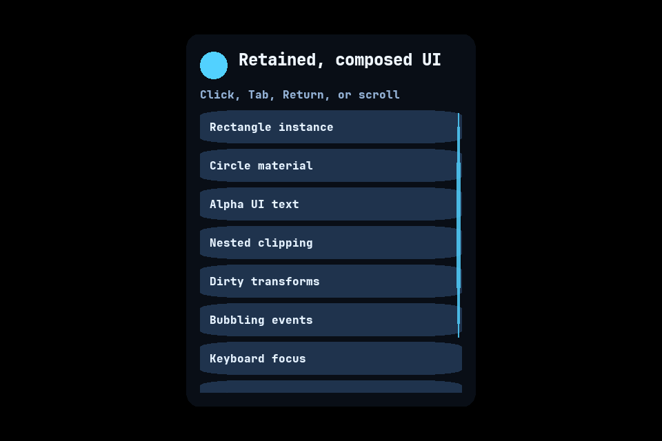
Copy the standalone UI example into a game component and register its constructor in nupp.lua. Both demos also ship as compiled components in the native package. See tecs.ui for the complete API.