On this page
tecs.ui
Build retained interfaces from ordinary Tecs entities.
tecs.ui supplies responsive layout, intrinsic sizing, clipping, scrolling, hit testing, keyboard focus, and semantic interaction events for HUDs, menus, inspectors, inventories, and in-world panels. A UI tree is an ECS hierarchy: spawn entities, relate them with ChildOf, describe their boxes with Style, and let the plugin update only the layout and GPU instance data that changed. Screen roots follow window resizing and pixel density automatically.
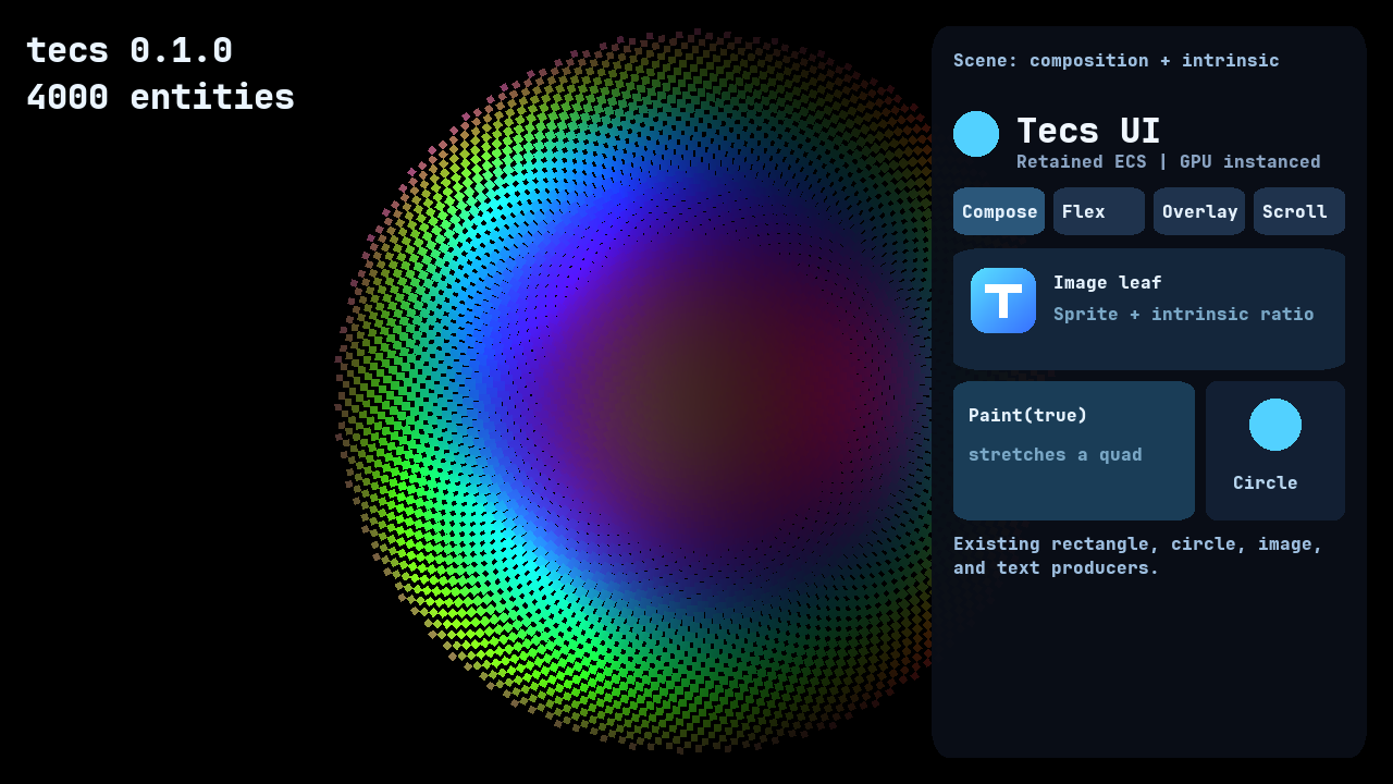
Use the module when several visual entities must size and position one another, when content must scroll or clip, or when pointer and keyboard input should target the same retained boxes that were drawn. It is not a DOM or a separate widget renderer. Existing rectangles, circles, sprites, images, and text remain the visible pieces, with their current materials, shaders, batching, and dirty tracking. tecs.ui composes those pieces and gives them layout and interaction.
Style describes layout rather than appearance. Put a drawing component on the same entity or on a child, and add Paint(true) when its transform should stretch to the computed box. Drawing remains in the existing instanced producers and shaders.
The complete interface guide contains 37 copyable recipes for layout, visual composition, intrinsic sizing, images, scrolling, interaction, focus, and dirty-aware updates. The examples below provide a complete starting point without leaving this API reference.
The plugin retains one native layout tree keyed by ECS entity ID. ChildOf is the layout hierarchy as well as the transform hierarchy. The layout system writes Layout only when the box changes and writes RelativeTransform2D only when layout or scrolling changes its result. Query membership observers retain structural invalidation, the ECS dirty-archetype set gates value updates, and the native tree computes only dirty roots before returning a compact list of changed boxes.
px, %, and auto dimension strings are parsed only when a Style enters or dirties the retained tree. Unchanged frames skip layout computation, layout export, clip reconstruction, and hit-rectangle reconstruction. A screen root installed through plugin(app) follows the application's logical window size and pixel density automatically. The plugin observes viewport changes on the world's platform event bus, so unchanged frames do not poll the window.
Intrinsic copies cached text, sprite-region, or custom leaf metrics into Taffy when the source component dirties. Wrapping text uses a bounded retained convergence pass: Taffy chooses its width, SDL_ttf measures that width exactly, and no native layout callback enters Lua.
Paint(true) centers and stretches a drawing leaf over its box. Keep containers at unit scale and put their rectangle, circle, or image on an absolute child with Paint: transform scale composes through ChildOf, so a stretched container would also scale its descendants.
Flex sizing and wrapping
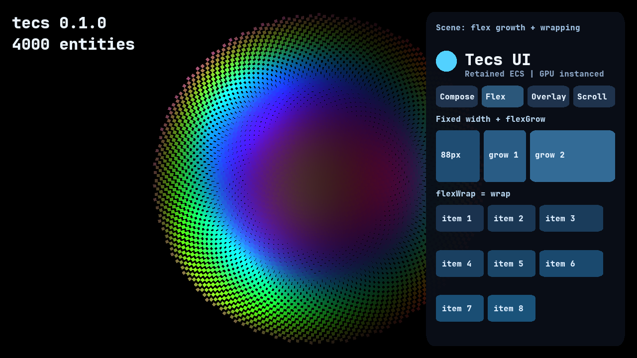
The first row compares a fixed 88px child with flexGrow weights one and two. The cards below use flexWrap = "wrap", so the screenshot shows both remaining-space distribution and line wrapping against one retained parent.
Absolute positioning and depth
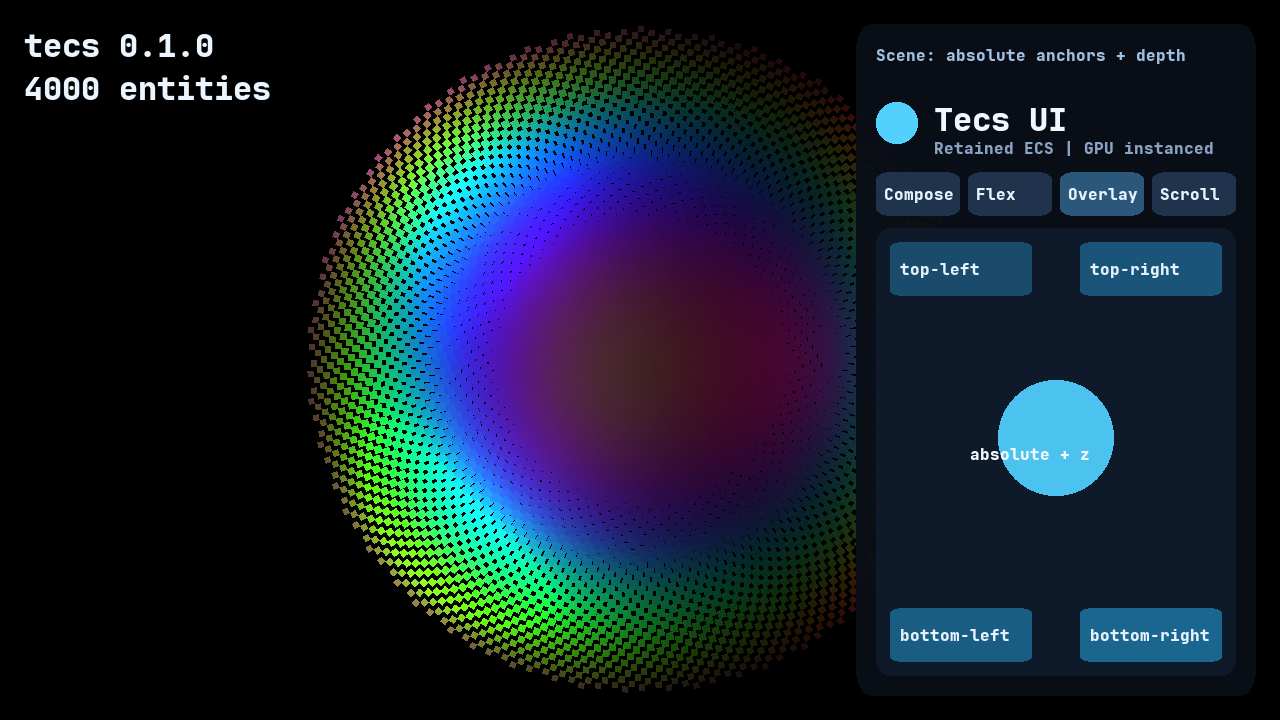
Absolute children anchor to their retained parent without consuming flex space. Renderer depth remains a separate concern, which is why the center circle and its label can sit above the four anchored cards.
Scrolling and clipping
Scroll turns its entity's layout box into a viewport. Its x and y move descendants, not the viewport entity itself. Every nested viewport is intersected before the plugin assigns the existing tecs.gfx.Clip component, so each drawable still carries one clip index in the ordinary GPU instance. firstClip and lastClip reserve which of the renderer’s 255 clip rectangles the UI owns.
Content extent includes negative, absolute, and nested descendants. Wheel distance that a deepest viewport cannot consume passes to its ancestors. reveal exposes a descendant programmatically, and Scrollbar derives a composed thumb transform without adding a renderer primitive. Snapshots retain scroll offsets and derive content extent again after load.
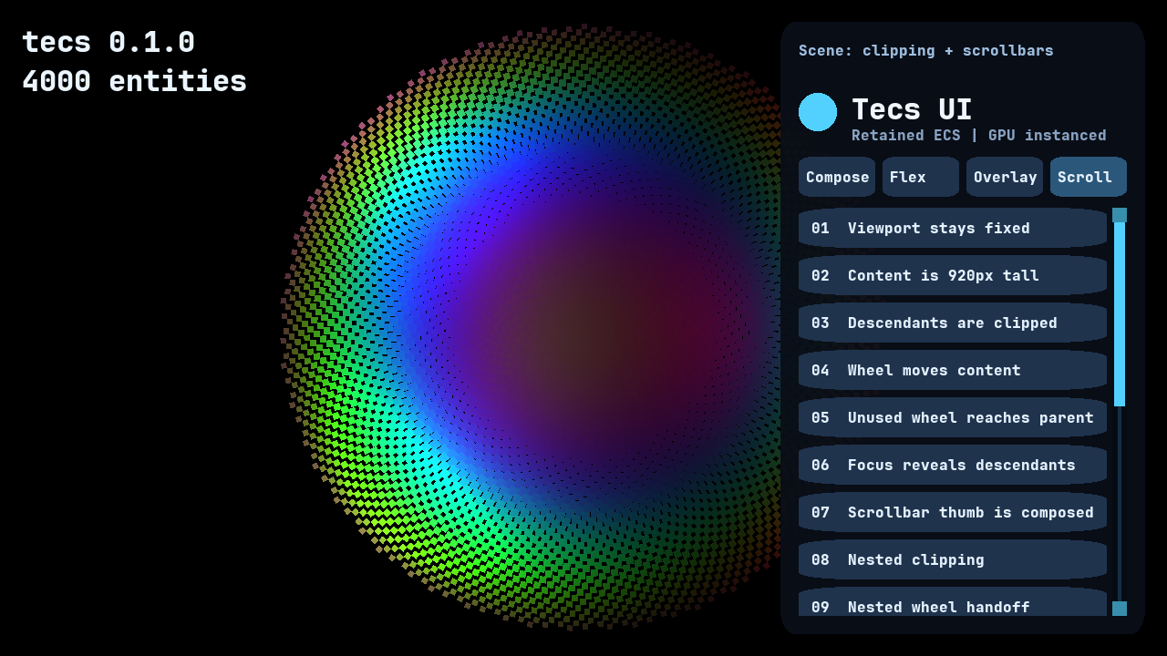
Screen roots use logical UI coordinates and multiply clips by pixelDensity. World roots project viewport corners through the renderer camera. Clip rectangles stay axis-aligned; rotating a scroll viewport therefore does not rotate its clip.
Interaction and navigation
Passing the application to plugin supplies its renderer and input, enabling clip-aware hit testing. Manual options remain available to tests and tools. Interaction opts in a layout box, and InteractionState reports hover, per-pointer capture, drag, and focus without replacing application state.
The plugin emits one bubbling Event at entity addresses. Mouse and touch identities capture independently; releasing over a captured target emits "click" and then "activate", while draggable targets emit semantic drag events. Tab and Shift-Tab traverse visible focusable controls and repeat while held, and Return or Space emits "activate" at the focused control. Programmatic focus, focus reveal, and modal focus scopes use the same state. A "wheel" event begins at the deepest viewport under the pointer; setting event.consumed = true prevents both ancestor delivery and default scrolling.
Hit priority uses the renderer's layer-depth calculation. A depth tie prefers the deeper UI node, explicit Interaction.order, and then stable retained insertion order. Style.style.order independently orders layout siblings. Give overlapping controls explicit orders and distinct renderer depth when both their input and drawing order are meaningful.
Complete application
Keep entity composition separate from plugin setup. This first block creates a full-window root, a centered panel, an ordinary GPU-rendered background, and intrinsically sized text:
local tecs <const> = require("tecs")
local ui <const> = tecs.ui
local ChildOf <const> = tecs.ecs.ChildOf
local RelativeTransform2D <const> = tecs.ecs.RelativeTransform2D
local Tint <const> = tecs.gfx.Tint
local Material <const> = tecs.gfx.Material
local Renderable2D <const> = tecs.gfx.Renderable2D

local function spawnInterface(
    world: tecs.World, app: tecs.Application, font: tecs.gfx.Font
)
    local root <const> = world:spawn(
        ui.Style({
            width = "100%",
            height = "100%",
            justifyContent = "center",
            alignItems = "center",
        }),
        ui.Root("screen"),
        tecs.Transform2D(0, 0, 0, 16)
    )

    local panel <const> = world:spawn(
        ui.Style({
            width = 420,
            height = 240,
            flexDirection = "column",
            padding = 20,
            gap = 12,
        }),
        RelativeTransform2D(),
        ChildOf(root)
    )

    world:spawn(
        ui.Style({position = "absolute", inset = 0}),
        ui.Paint(true),
        RelativeTransform2D(0, 0, 0),
        Tint(0.035, 0.055, 0.09, 0.96),
        Material(tecs.gfx.materials.id("rounded"), 0.05),
        Renderable2D(),
        ChildOf(panel)
    )

    world:spawn(
        ui.Style({maxWidth = "100%"}),
        ui.Intrinsic("text", {wrap = true}),
        RelativeTransform2D(0, 0, 1),
        Tint(0.94, 0.97, 1.0, 1.0),
        tecs.gfx.Text.new({
            text = "This text and panel are ordinary ECS entities.",
            font = font,
            size = 16,
        }),
        ChildOf(panel)
    )
end
The application plugin installs text and UI before a Startup system spawns the retained entities. Passing app to ui.plugin supplies the renderer, input, window size, and pixel density:
local function gamePlugin(world: tecs.World, app: tecs.Application)
    tecs.gfx.layers.configure(
        16,
        {
            sort = "z",
            screenSpace = true,
            unlit = true,
        }
    )
    world:addPlugin(tecs.gfx.textPlugin({renderer = app.renderer}))
    world:addPlugin(ui.plugin(app))
    world:addSystem({
        name = "game.SpawnInterface",
        phase = tecs.ecs.phases.Startup,
        run = function()
            local font <const> = tecs.gfx.newTTF({
                source = "fonts/JetBrainsMono-ExtraBold.ttf",
                name = "game-ui-16",
                size = 16,
                raster = "alpha",
            }):wait().value
            spawnInterface(world, app, font)
        end,
    })
end

return tecs.newApplication({plugin = gamePlugin})
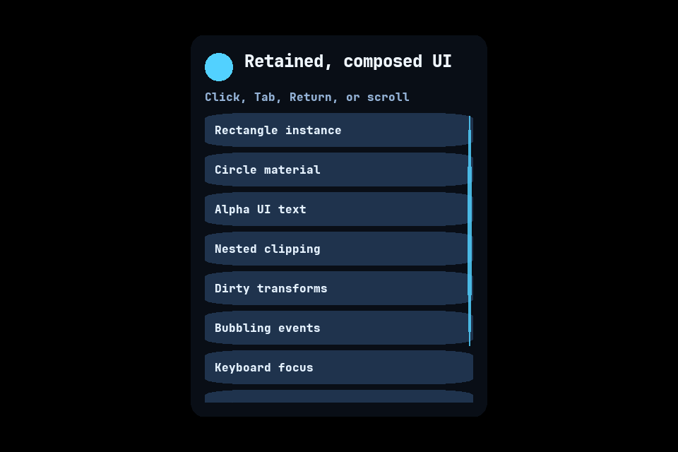
The standalone docs/examples/ui.tl application expands that setup into a scrollable, keyboard-navigable panel:
Common recipes
Stretch an ordinary rectangle over a layout box
Put the drawing component on an absolute child. Paint(true) copies the computed width and height into its relative transform without scaling the container's descendants:
local card <const> = world:spawn(
    ui.Style({width = 280, height = 120}),
    RelativeTransform2D(),
    ChildOf(panel)
)

world:spawn(
    ui.Style({position = "absolute", inset = 0}),
    ui.Paint(true),
    RelativeTransform2D(0, 0, 0),
    Tint(0.10, 0.17, 0.27, 1.0),
    Material(tecs.gfx.materials.id("rounded"), 0.08),
    Renderable2D(),
    ChildOf(card)
)
Load an image and preserve its aspect ratio
The asset loader decodes pixels asynchronously. The renderer registers them and returns the ordinary sprite consumed by Intrinsic("image"):
tecs.assets.loadImage(
    tecs.io.files.assetPath("images/portrait.png")
):map(function(image: tecs.assets.Image): tecs.gfx.Sprite
    return app.renderer.sprites:registerImage(image)
end):onSettle(function(loaded: tecs.Future<tecs.gfx.Sprite>)
    if loaded.status == "ready" then
        world:spawn(
            ui.Style({height = 64}),
            ui.Intrinsic("image"),
            ui.Paint(true),
            RelativeTransform2D(0, 0, 2),
            loaded.value,
            Tint(1, 1, 1, 1),
            Renderable2D(),
            ChildOf(panel)
        )
    end
end)
Create a clipped scrolling list
Scroll belongs on the fixed viewport. Its larger child creates overflow, and the scrollbar is an ordinary composed drawing entity rather than a Taffy or renderer primitive:
local viewport <const> = world:spawn(
    ui.Style({width = "100%", height = 240}),
    ui.Scroll(),
    RelativeTransform2D(),
    ChildOf(panel)
)

local content <const> = world:spawn(
    ui.Style({
        width = "100%",
        height = 600,
        flexDirection = "column",
        gap = 8,
    }),
    RelativeTransform2D(),
    ChildOf(viewport)
)

world:spawn(
    ui.Scrollbar("vertical", 12, 4, 28),
    ui.Interaction({focusable = false, draggable = true, order = 100}),
    RelativeTransform2D(0, 0, 10),
    Tint(0.32, 0.82, 1.0, 1.0),
    Material(tecs.gfx.materials.id("rounded"), 0),
    Renderable2D(),
    ChildOf(viewport)
)
Observe pointer and keyboard activation
Interaction makes the computed box selectable but draws nothing. Events bubble through ChildOf, and Return or Space produces the same activate event as a click:
local type uiTypes = require("tecs.ui")
local type UiEvent = uiTypes.Event

local button <const> = world:spawn(
    ui.Style({width = 180, height = 44}),
    ui.Interaction({tabIndex = 1}),
    RelativeTransform2D(),
    ChildOf(content)
)

world:observe(
    button,
    ui.Event,
    function(event: UiEvent)
        if event.kind == "activate" then
            print("activated via", event.source)
        end
    end
)
Change a retained style
Use getMut only when a property actually changes. This dirties the retained style once; unchanged frames do not parse the string or recompute the tree:
local style <const> = world:getMut(panel, ui.Style)
style.style.width = "100%"
style.style.maxWidth = "480px"
Focus and reveal a control
Programmatic focus uses the same state and navigation order as Tab. Focusing a clipped descendant reveals it through every ancestor viewport:
ui.focus(world, button)
ui.reveal(world, button, "center")

local focused <const> = ui.focused(world)
if focused == button then
    ui.blur(world)
end
Module contents
Types
| Type | Kind | Description |
|---|---|---|
Event |
record | Event reports one semantic interaction at an entity address. |
EventKind |
enum | Identifies one semantic UI interaction. |
FocusScope |
record | FocusScope marks an entity that may become the active navigation boundary. |
Interaction |
record | Interaction makes one computed layout box a UI input target. |
InteractionSource |
enum | Identifies what initiated a semantic UI event. |
InteractionState |
record | InteractionState reports transient state derived by the UI plugin. |
Intrinsic |
record | Intrinsic supplies cached leaf metrics to layout without a Lua callback. |
IntrinsicSource |
enum | Selects which leaf component owns natural dimensions. |
Layout |
record | Layout reports the last box computed by retained layout. |
Options |
record | Options configures rendering, input, scrolling, and the owned clip-index range. |
Overrides |
record | Overrides changes scrolling and clip allocation without repeating an application's renderer and input. |
Paint |
record | Paint controls how a drawing component consumes its layout box. |
PointerType |
enum | Identifies the pointer device associated with an event. |
RevealAlign |
enum | Selects where reveal places a descendant in each viewport. |
Root |
record | Root supplies the available space and coordinate mapping for one tree. |
RootSizing |
enum | Selects where a root receives its available dimensions. |
RootSpace |
enum | Selects whether a root uses screen or world coordinates. |
Scroll |
record | Scroll offsets descendants and clips them to this entity's layout box. |
ScrollAxis |
enum | Selects the dimension controlled by a scrollbar thumb. |
Scrollbar |
record | Scrollbar derives one composed thumb transform from an ancestor viewport. |
Style |
record | Style stores the layout properties that place one UI entity. |
Functions
| Function | Kind | Description |
|---|---|---|
blur |
Static | Clears the world's focused interaction. |
focus |
Static | Moves focus to one enabled, focusable interaction. |
focused |
Static | Returns the world's focused interaction. |
plugin |
Static | Returns a plugin that derives layout, transforms, clipping, and optional interaction from retained layout nodes. |
popFocusScope |
Static | Pops the active navigation boundary and restores its saved focus. |
pushFocusScope |
Static | Pushes one modal navigation boundary and remembers the current focus. |
reveal |
Static | Scrolls every ancestor viewport enough to expose one descendant. |
Values
| Value | Type | Description |
|---|---|---|
Node |
Component |
Read-only. Exposes the tag that marks an entity as participating in UI layout. |
Types
tecs.ui.Event record
Event reports one semantic interaction at an entity address. Read-only. Exposes the event type delivered to an interaction target and its ChildOf ancestors.
record tecs.ui.Event is events.Event
    kind: EventKind
    target: integer
    currentTarget: integer
    x: number
    y: number
    button: integer
    pointerId: string
    pointerType: PointerType
    deltaX: number
    deltaY: number
    source: InteractionSource
    consumed: boolean

    init: function(
        event: Event,
        kind: EventKind,
        target: integer,
        x: number,
        y: number,
        button: integer,
        pointerId: string,
        pointerType: PointerType,
        deltaX: number,
        deltaY: number,
        source: InteractionSource
    )
end
Interfaces
| Interface |
|---|
events.Event |
Examples
Handles pointer and keyboard activation through the same observer.
local tecs <const> = require("tecs")
local ui <const> = tecs.ui
local type uiTypes = require("tecs.ui")
local type UiEvent = uiTypes.Event
local world <const> = tecs.ecs.newWorld()
local button <const> = world:spawn(ui.Interaction({tabIndex = 1}))

world:observe(
    button,
    ui.Event,
    function(event: UiEvent)
        if event.kind == "activate" then
            print("activated via", event.source)
        end
    end
)
tecs.ui.Event.kind field
Read-only. Reports "pointerEnter", "pointerLeave", "pointerDown", "pointerMove", "pointerUp", "click", "wheel", "focus", "blur", "activate", "dragStart", "dragMove", "dragEnd", or "dragCancel".
tecs.ui.Event.target field
Read-only. Identifies the entity where dispatch began.
tecs.ui.Event.currentTarget field
Read-only. Identifies the entity whose observers are currently receiving this bubbling event.
tecs.ui.Event.currentTarget: integertecs.ui.Event.x field
Read-only. Reports the pointer's horizontal window coordinate.
tecs.ui.Event.y field
Read-only. Reports the pointer's vertical window coordinate.
tecs.ui.Event.button field
Read-only. Reports the mouse button, or zero for touch and events that have no button.
tecs.ui.Event.pointerId field
Read-only. Identifies "mouse" or one opaque touch identity. Keyboard, controller, and programmatic events use the empty string.
tecs.ui.Event.pointerType field
Read-only. Reports "mouse", "touch", "pen", or "none".
tecs.ui.Event.pointerType: PointerTypetecs.ui.Event.deltaX field
Read-only. Reports horizontal movement for pointer-move, drag, and wheel events, or zero for other events.
tecs.ui.Event.deltaY field
Read-only. Reports vertical movement for pointer-move, drag, and wheel events, or zero for other events.
tecs.ui.Event.source field
Read-only. Reports "pointer", "keyboard", "controller", or "programmatic" as the activation source.
tecs.ui.Event.source: InteractionSourcetecs.ui.Event.consumed field
Caller-writable. An observer may set this field to stop bubbling and suppress the default wheel scroll.
tecs.ui.Event.init Static
function tecs.ui.Event.init(
    event: Event,
    kind: EventKind,
    target: integer,
    x: number,
    y: number,
    button: integer,
    pointerId: string,
    pointerType: PointerType,
    deltaX: number,
    deltaY: number,
    source: InteractionSource
)
Arguments
| Name | Type | Description |
|---|---|---|
event |
Event |
|
kind |
EventKind |
|
target |
integer |
|
x |
number |
|
y |
number |
|
button |
integer |
|
pointerId |
string |
|
pointerType |
PointerType |
|
deltaX |
number |
|
deltaY |
number |
|
source |
InteractionSource |
Returns
None.
tecs.ui.EventKind enum
Identifies one semantic UI interaction.
enum tecs.ui.EventKind
    "activate"
    "blur"
    "click"
    "dragCancel"
    "dragEnd"
    "dragMove"
    "dragStart"
    "focus"
    "pointerDown"
    "pointerEnter"
    "pointerLeave"
    "pointerMove"
    "pointerUp"
    "wheel"
end
tecs.ui.FocusScope record
FocusScope marks an entity that may become the active navigation boundary. Read-only. Exposes the marker used by pushFocusScope.
record tecs.ui.FocusScope is Component
end
Interfaces
| Interface |
|---|
Component |
Examples
Marks a dialog as a boundary for modal pointer and keyboard navigation.
local tecs <const> = require("tecs")
local ui <const> = tecs.ui
local world <const> = tecs.ecs.newWorld()
local root <const> = world:spawn(ui.Style({width = 1280, height = 720}))

local dialog <const> = world:spawn(
    ui.Style({width = 440, height = 260}),
    ui.FocusScope(),
    tecs.ecs.RelativeTransform2D(),
    tecs.ecs.ChildOf(root)
)
tecs.ui.Interaction record
Interaction makes one computed layout box a UI input target. Read-only. Exposes the component that admits a layout box to hit testing and keyboard navigation.
record tecs.ui.Interaction is Component
    enabled: boolean
    focusable: boolean
    tabIndex: integer
    order: integer
    draggable: boolean
end
Interfaces
| Interface |
|---|
Component |
Examples
Creates a focusable control with an explicit Tab position.
local tecs <const> = require("tecs")
local ui <const> = tecs.ui
local world <const> = tecs.ecs.newWorld()
local panel <const> = world:spawn(ui.Style({width = 480, height = 360}))

local button <const> = world:spawn(
    ui.Style({width = 180, height = 44}),
    ui.Interaction({tabIndex = 1, draggable = false}),
    tecs.ecs.RelativeTransform2D(),
    tecs.ecs.ChildOf(panel)
)
tecs.ui.Interaction.enabled field
Caller-writable. The caller controls whether hit testing and navigation can select this entity. The default is true.
tecs.ui.Interaction.enabled: booleantecs.ui.Interaction.focusable field
Caller-writable. The caller controls whether clicking or keyboard navigation can focus this entity. The default is true.
tecs.ui.Interaction.focusable: booleantecs.ui.Interaction.tabIndex field
Caller-writable. The caller orders keyboard focus. Positive values come first in ascending order, zero values follow in authorial order, and negative values skip keyboard navigation.
tecs.ui.Interaction.tabIndex: integertecs.ui.Interaction.order field
Caller-writable. The caller supplies an authorial tie-breaker for hit testing and focus when controls share renderer depth and tab index. Higher values hit later; lower values focus first.
tecs.ui.Interaction.order: integertecs.ui.Interaction.draggable field
Caller-writable. The caller enables semantic drag events after pointer movement crosses the plugin's drag threshold.
tecs.ui.Interaction.draggable: booleantecs.ui.InteractionSource enum
Identifies what initiated a semantic UI event.
enum tecs.ui.InteractionSource
    "controller"
    "keyboard"
    "pointer"
    "programmatic"
end
tecs.ui.InteractionState record
InteractionState reports transient state derived by the UI plugin. Read-only. Exposes transient hover, press, and focus state.
record tecs.ui.InteractionState is Component
    hovered: boolean
    pressed: boolean
    focused: boolean
    dragging: boolean
end
Interfaces
| Interface |
|---|
Component |
Examples
Reads transient focus state without dirtying the retained control.
local tecs <const> = require("tecs")
local ui <const> = tecs.ui
local world <const> = tecs.ecs.newWorld()
local button <const> = world:spawn(ui.Interaction({tabIndex = 1}))

local state <const> = world:get(button, ui.InteractionState)
if state ~= nil and state.focused then
    print("button has keyboard focus")
end
tecs.ui.InteractionState.hovered field
Engine-owned. The engine reports whether the pointer is over the entity's visible, clipped box. Ordinary game code may read this field to choose its visual state and must not write it.
tecs.ui.InteractionState.hovered: booleantecs.ui.InteractionState.pressed field
Engine-owned. The engine reports whether at least one pointer was pressed on the entity and remains captured. Ordinary game code may read this field and must not write it.
tecs.ui.InteractionState.pressed: booleantecs.ui.InteractionState.focused field
Engine-owned. The engine reports whether keyboard activation currently targets the entity. Ordinary game code may read this field and must not write it.
tecs.ui.InteractionState.focused: booleantecs.ui.InteractionState.dragging field
Engine-owned. The engine reports whether at least one captured pointer is dragging this entity. Ordinary game code may read this field and must not write it.
tecs.ui.InteractionState.dragging: booleantecs.ui.Intrinsic record
Intrinsic supplies cached leaf metrics to layout without a Lua callback. Read-only. Exposes cached custom, text, or image leaf measurement.
record tecs.ui.Intrinsic is Component
    source: IntrinsicSource
    width: number
    height: number
    minWidth: number
    scale: number
    wrap: boolean
end
Interfaces
| Interface |
|---|
Component |
Examples
Selects natural text, image, or custom leaf measurements.
local tecs <const> = require("tecs")
local ui <const> = tecs.ui

local wrappedText <const> = ui.Intrinsic("text", {wrap = true})
local imageSize <const> = ui.Intrinsic("image")
local customSize <const> = ui.Intrinsic(
    "custom", {width = 96, height = 28, minWidth = 48}
)
tecs.ui.Intrinsic.source field
Caller-writable. The caller selects "custom", "text", or "image". Text reads tecs.gfx.text.Text; image reads tecs.components.Sprite; custom reads the dimensions below.
tecs.ui.Intrinsic.source: IntrinsicSourcetecs.ui.Intrinsic.width field
Caller-writable. The caller supplies the preferred custom width in logical units. Text and image sources ignore this field.
tecs.ui.Intrinsic.height field
Caller-writable. The caller supplies the preferred custom height in logical units. Text and image sources ignore this field.
tecs.ui.Intrinsic.minWidth field
Caller-writable. The caller supplies the custom minimum-content width. Zero uses width. Text derives its longest unbroken run and image sources preserve their aspect ratio instead.
tecs.ui.Intrinsic.scale field
Caller-writable. The caller scales text or source-image units into UI units. The default is one.
tecs.ui.Intrinsic.wrap field
Caller-writable. The caller lets Taffy choose a text line width and lets the plugin write that result to Text.wrapWidth. Other sources ignore this field.
tecs.ui.IntrinsicSource enum
Selects which leaf component owns natural dimensions.
enum tecs.ui.IntrinsicSource
    "custom"
    "image"
    "text"
end
tecs.ui.Layout record
Layout reports the last box computed by retained layout. Read-only. Exposes the component that reports a computed box without becoming a drawing primitive.
Interfaces
| Interface |
|---|
Component |
Examples
Reads the final logical size after the UI layout phase.
local tecs <const> = require("tecs")
local ui <const> = tecs.ui
local world <const> = tecs.ecs.newWorld()
local panel <const> = world:spawn(ui.Style({width = 480, height = 320}))

local box <const> = world:get(panel, ui.Layout)
if box ~= nil then
    print(("%.0f x %.0f"):format(box.width, box.height))
end
tecs.ui.Layout.x field
Read-only. The engine reports the box's X offset from its parent.
tecs.ui.Layout.y field
Read-only. The engine reports the box's Y offset from its parent.
tecs.ui.Layout.width field
Read-only. The engine reports the box width in logical units.
tecs.ui.Layout.height field
Read-only. The engine reports the box height in logical units.
tecs.ui.Options record
Options configures rendering, input, scrolling, and the owned clip-index range.
record tecs.ui.Options
    renderer: Renderer
    firstClip: integer
    lastClip: integer
    input: any
    layer: any
    wheelStep: number
    dragThreshold: number
end
tecs.ui.Options.renderer field
Caller-writable. The caller supplies the renderer whose camera and GPU clip table the UI uses.
tecs.ui.Options.firstClip field
Caller-writable. The caller reserves the first UI-owned clip index. The default is one.
tecs.ui.Options.lastClip field
Caller-writable. The caller reserves the last UI-owned clip index. The default is 255.
tecs.ui.Options.input field
Caller-writable. The caller supplies the application's folded input to enable hit testing, scrolling, focus, and activation. Omitting it installs layout and clipping only.
tecs.ui.Options.layer field
Caller-writable. The caller supplies the input layer the UI may read. Omitting it reads the base layer.
tecs.ui.Options.wheelStep field
Caller-writable. The caller sets logical scroll units per wheel unit. The default is 40.
tecs.ui.Options.dragThreshold field
Caller-writable. The caller sets pointer movement in logical units before a draggable capture emits "dragStart". The default is four.
tecs.ui.Options.dragThreshold: numbertecs.ui.Overrides record
Overrides changes scrolling and clip allocation without repeating an application's renderer and input.
record tecs.ui.Overrides
    firstClip: integer
    lastClip: integer
    layer: any
    wheelStep: number
    dragThreshold: number
end
tecs.ui.Overrides.firstClip field
Caller-writable. The caller reserves the first UI-owned clip index. The default is one.
tecs.ui.Overrides.lastClip field
Caller-writable. The caller reserves the last UI-owned clip index. The default is 255.
tecs.ui.Overrides.layer field
Caller-writable. The caller supplies the input layer the UI may read. Omitting it reads the base layer.
tecs.ui.Overrides.wheelStep field
Caller-writable. The caller sets logical scroll units per wheel unit. The default is 40.
tecs.ui.Overrides.dragThreshold field
Caller-writable. The caller sets pointer movement in logical units before a draggable capture emits "dragStart". The default is four.
tecs.ui.Overrides.dragThreshold: numbertecs.ui.Paint record
Paint controls how a drawing component consumes its layout box. Read-only. Exposes the component that optionally stretches an existing primitive to its computed box.
Interfaces
| Interface |
|---|
Component |
Examples
Stretches an ordinary rounded rectangle over its retained layout box.
local tecs <const> = require("tecs")
local ui <const> = tecs.ui
local world <const> = tecs.ecs.newWorld()
local panel <const> = world:spawn(ui.Style({width = 480, height = 320}))

world:spawn(
    ui.Style({position = "absolute", inset = 0}),
    ui.Paint(true),
    tecs.ecs.RelativeTransform2D(0, 0, 1),
    tecs.gfx.Tint(0.1, 0.2, 0.3, 1),
    tecs.gfx.Material(tecs.gfx.materials.id("rounded"), 0.1),
    tecs.gfx.Renderable2D(),
    tecs.ecs.ChildOf(panel)
)
tecs.ui.Paint.stretch field
Caller-writable. The caller enables stretch to copy the layout width and height into RelativeTransform2D.scaleX and scaleY.
tecs.ui.PointerType enum
Identifies the pointer device associated with an event.
enum tecs.ui.PointerType
    "mouse"
    "none"
    "pen"
    "touch"
end
tecs.ui.RevealAlign enum
Selects where reveal places a descendant in each viewport.
enum tecs.ui.RevealAlign
    "center"
    "end"
    "nearest"
    "start"
end
tecs.ui.Root record
Root supplies the available space and coordinate mapping for one tree. Read-only. Exposes the component that gives a retained UI tree its available size and coordinate space.
record tecs.ui.Root is Component
    space: RootSpace
    width: number
    height: number
    pixelDensity: number
    sizing: RootSizing
end
Interfaces
| Interface |
|---|
Component |
Examples
Creates a screen root that follows the application window automatically.
local tecs <const> = require("tecs")
local ui <const> = tecs.ui
local world <const> = tecs.ecs.newWorld()

local root <const> = world:spawn(
    ui.Style({width = "100%", height = "100%"}),
    ui.Root("screen"),
    tecs.Transform2D(0, 0, 0, 16)
)
tecs.ui.Root.space field
Caller-writable. The caller chooses "screen" for logical screen coordinates or "world" for coordinates projected by the camera.
tecs.ui.Root.width field
Caller-writable. The caller supplies the layout root width. An application-backed screen root with automatic sizing follows the logical window width; a camera-sized world root derives world units from the physical viewport and camera zoom.
tecs.ui.Root.height field
Caller-writable. The caller supplies the layout root height. An application-backed screen root with automatic sizing follows the logical window height; a camera-sized world root derives world units from the physical viewport and camera zoom.
tecs.ui.Root.pixelDensity field
Caller-writable. The caller supplies target pixels per logical point. The default is one. Automatic screen and camera-sized world roots follow the window's current pixel density.
tecs.ui.Root.pixelDensity: numbertecs.ui.Root.sizing field
Caller-writable. The caller selects "auto" for the standard behavior, "manual" to preserve every authored field, or "camera" on a world root to derive its extent and transform from the active camera. "auto" follows the window for screen roots and is manual for world roots.
tecs.ui.Root.sizing: RootSizingtecs.ui.RootSizing enum
Selects where a root receives its available dimensions.
enum tecs.ui.RootSizing
    "auto"
    "camera"
    "manual"
end
tecs.ui.RootSpace enum
Selects whether a root uses screen or world coordinates.
enum tecs.ui.RootSpace
    "screen"
    "world"
end
tecs.ui.Scroll record
Scroll offsets descendants and clips them to this entity's layout box. Read-only. Exposes the component that offsets descendants and clips their existing GPU instances.
record tecs.ui.Scroll is Component
    x: number
    y: number
    contentWidth: number
    contentHeight: number
    contentX: number
    contentY: number
end
Interfaces
| Interface |
|---|
Component |
Examples
Creates a fixed viewport and changes its retained vertical offset.
local tecs <const> = require("tecs")
local ui <const> = tecs.ui
local world <const> = tecs.ecs.newWorld()
local panel <const> = world:spawn(ui.Style({width = 480, height = 360}))

local viewport <const> = world:spawn(
    ui.Style({width = "100%", height = 240}),
    ui.Scroll(),
    tecs.ecs.RelativeTransform2D(),
    tecs.ecs.ChildOf(panel)
)

local scroll <const> = world:getMut(viewport, ui.Scroll)
scroll.y = scroll.y + 80
tecs.ui.Scroll.x field
Caller-writable. The caller supplies the horizontal scroll offset in logical units.
tecs.ui.Scroll.y field
Caller-writable. The caller supplies the vertical scroll offset in logical units.
tecs.ui.Scroll.contentWidth field
Engine-owned. The engine reports the horizontal extent of retained content, including nested and absolute descendants. Ordinary game code should ignore this field.
tecs.ui.Scroll.contentWidth: numbertecs.ui.Scroll.contentHeight field
Engine-owned. The engine reports the vertical extent of retained content, including nested and absolute descendants. Ordinary game code should ignore this field.
tecs.ui.Scroll.contentHeight: numbertecs.ui.Scroll.contentX field
Engine-owned. The engine reports the smallest horizontal content coordinate, including negative-positioned descendants. Ordinary game code should ignore this field.
tecs.ui.Scroll.contentY field
Engine-owned. The engine reports the smallest vertical content coordinate, including negative-positioned descendants. Ordinary game code should ignore this field.
tecs.ui.ScrollAxis enum
Selects the dimension controlled by a scrollbar thumb.
enum tecs.ui.ScrollAxis
    "horizontal"
    "vertical"
end
tecs.ui.Scrollbar record
Scrollbar derives one composed thumb transform from an ancestor viewport. Read-only. Exposes a composed scrollbar thumb driven by its parent viewport.
record tecs.ui.Scrollbar is Component
    axis: ScrollAxis
    thickness: number
    inset: number
    minLength: number
end
Interfaces
| Interface |
|---|
Component |
Examples
Composes a square vertical thumb from ordinary renderer components.
local tecs <const> = require("tecs")
local ui <const> = tecs.ui
local world <const> = tecs.ecs.newWorld()
local viewport <const> = world:spawn(
    ui.Style({width = 480, height = 240}), ui.Scroll()
)

world:spawn(
    ui.Scrollbar("vertical", 12, 4, 28),
    ui.Interaction({focusable = false, draggable = true}),
    tecs.ecs.RelativeTransform2D(0, 0, 10),
    tecs.gfx.Tint(0.32, 0.82, 1, 1),
    tecs.gfx.Material(tecs.gfx.materials.id("rounded"), 0),
    tecs.gfx.Renderable2D(),
    tecs.ecs.ChildOf(viewport)
)
tecs.ui.Scrollbar.axis field
Caller-writable. The caller selects "horizontal" or "vertical".
tecs.ui.Scrollbar.axis: ScrollAxistecs.ui.Scrollbar.thickness field
Caller-writable. The caller sets the thumb thickness in logical units.
tecs.ui.Scrollbar.inset field
Caller-writable. The caller leaves this much room inside each end of the viewport track.
tecs.ui.Scrollbar.minLength field
Caller-writable. The caller sets the smallest thumb length in logical units.
tecs.ui.Style record
Style stores the layout properties that place one UI entity. Read-only. Exposes the component that supplies retained layout properties and adds Layout and tecs.gfx.Clip.
Interfaces
| Interface |
|---|
Component |
Examples
Builds a column whose width follows its parent up to 480 logical pixels.
local tecs <const> = require("tecs")
local ui <const> = tecs.ui
local world <const> = tecs.ecs.newWorld()
local root <const> = world:spawn(ui.Style({width = 1280, height = 720}))

local panel <const> = world:spawn(
    ui.Style({
        width = "100%",
        maxWidth = 480,
        flexDirection = "column",
        padding = 20,
        gap = 12,
    }),
    tecs.ecs.RelativeTransform2D(),
    tecs.ecs.ChildOf(root)
)
tecs.ui.Style.style field
Caller-writable. The caller supplies a table and marks Style dirty after mutating it. Numbers and "24px" strings use logical UI pixels, "50%" is parent-relative, and "auto" selects automatic sizing. Invalid strings raise when the plugin synchronizes the style. The older {value=number, unit="percent"} and unit="points" table forms remain supported.
Supported keys are display, position, flexDirection, flexWrap, justifyContent, alignItems, alignContent, flexGrow, flexShrink, flexBasis, width, height, minWidth, minHeight, maxWidth, maxHeight, margin, padding, border, gap, rowGap, inset, and the Tecs-only integer order used to retain authorial sibling order. Edge values accept one dimension or a table with left, right, top, and bottom.
Functions
tecs.ui.blur Static
Clears the world's focused interaction.
function tecs.ui.blur(world: World): booleanArguments
| Name | Type | Description |
|---|---|---|
world |
World |
The caller supplies a world with the UI plugin. |
Returns
| Type | Description |
|---|---|
boolean |
Returns false when the plugin is missing. |
Examples
Clears the current keyboard focus when one exists.
local tecs <const> = require("tecs")
local ui <const> = tecs.ui
local world <const> = tecs.ecs.newWorld()

if ui.focused(world) ~= nil then
    ui.blur(world)
end
tecs.ui.focus Static
Moves focus to one enabled, focusable interaction.
function tecs.ui.focus(
    world: World, entity: integer
): boolean
Arguments
| Name | Type | Description |
|---|---|---|
world |
World |
The caller supplies a world with the UI plugin. |
entity |
integer |
The caller supplies the interaction to focus. |
Returns
| Type | Description |
|---|---|
boolean |
Returns false when the plugin is missing or the entity cannot receive focus. |
Examples
Moves keyboard focus to an enabled, focusable control.
local tecs <const> = require("tecs")
local ui <const> = tecs.ui
local world <const> = tecs.ecs.newWorld()
local saveButton <const> = world:spawn(ui.Interaction({tabIndex = 1}))

if not ui.focus(world, saveButton) then
    print("save button cannot receive focus")
end
tecs.ui.focused Static
Returns the world's focused interaction.
function tecs.ui.focused(world: World): integerArguments
| Name | Type | Description |
|---|---|---|
world |
World |
The caller supplies a world with or without the UI plugin. |
Returns
| Type | Description |
|---|---|
integer |
Returns the focused entity, or nil when nothing is focused. |
Examples
Finds the interaction that currently owns keyboard focus.
local tecs <const> = require("tecs")
local ui <const> = tecs.ui
local world <const> = tecs.ecs.newWorld()

local current <const> = ui.focused(world)
if current ~= nil then
    print("focused entity", current)
end
tecs.ui.plugin Static
Returns a plugin that derives layout, transforms, clipping, and optional interaction from retained layout nodes.
The plugin owns every renderer clip index from firstClip through lastClip, inclusive. Reserve a smaller range when another system also calls renderer.sprites:setClipRegion. Exhausting the range raises rather than drawing unclipped content.
Passing an Application supplies its renderer, input, and window. The plugin samples the viewport initially, then observes platform resize, pixel-size, display, and display-scale events at world address zero. It coalesces them and refreshes automatic roots before layout without polling the window on unchanged frames. The optional second argument overrides clip allocation, the input layer, and wheel distance. Passing Options directly preserves manual wiring for tests, tools, and worlds not owned by an application. When input is present, the plugin reads its configured layer in PreUpdate. It uses the hit geometry derived after the previous frame's layout and clipping, which is the geometry the player was shown when the input arrived.
Arguments
| Name | Type | Description |
|---|---|---|
source |
any |
The caller supplies an application or manually wired options containing a renderer. |
overrides |
Overrides |
The caller may override source defaults without repeating its renderer and input. |
Returns
| Type | Description |
|---|---|
function(World) |
Returns a plugin for world:addPlugin. Each world receives a separate retained tree and clip allocator. |
Examples
Installs UI with explicit dependencies in a test or manually constructed world.
local tecs <const> = require("tecs")
local type Renderer = require("tecs.Renderer")
local type inputTypes = require("tecs.input")

local function installManualUi(
    world: tecs.World, renderer: Renderer, input: inputTypes.Input
)
    world:addPlugin(tecs.ui.plugin({
        renderer = renderer,
        input = input,
        firstClip = 32,
        lastClip = 63,
    }))
end
Installs UI from an application so roots follow its window and input.
local tecs <const> = require("tecs")

local function gamePlugin(world: tecs.World, app: tecs.Application)
    world:addPlugin(tecs.ui.plugin(
        app,
        {
            wheelStep = 36,
            dragThreshold = 4,
        }
    ))
end
tecs.ui.popFocusScope Static
Pops the active navigation boundary and restores its saved focus.
function tecs.ui.popFocusScope(world: World, scope: integer): booleanArguments
| Name | Type | Description |
|---|---|---|
world |
World |
The caller supplies a world with the UI plugin. |
scope |
integer |
The caller may require a particular active scope. |
Returns
| Type | Description |
|---|---|
boolean |
Returns false when the plugin is missing or the requested scope is not active. |
Examples
Closes the active modal boundary and restores its saved focus.
local tecs <const> = require("tecs")
local ui <const> = tecs.ui
local world <const> = tecs.ecs.newWorld()
local dialog <const> = world:spawn(ui.FocusScope())

if not ui.popFocusScope(world, dialog) then
    print("dialog is not the active focus scope")
end
tecs.ui.pushFocusScope Static
Pushes one modal navigation boundary and remembers the current focus.
function tecs.ui.pushFocusScope(world: World, scope: integer): booleanArguments
| Name | Type | Description |
|---|---|---|
world |
World |
The caller supplies a world with the UI plugin. |
scope |
integer |
The caller supplies an entity carrying FocusScope. |
Returns
| Type | Description |
|---|---|
boolean |
Returns false when the plugin or scope is missing. |
Examples
Activates a modal scope and focuses its first control.
local tecs <const> = require("tecs")
local ui <const> = tecs.ui
local world <const> = tecs.ecs.newWorld()
local dialog <const> = world:spawn(ui.FocusScope())
local firstDialogControl <const> = world:spawn(
    ui.Interaction({tabIndex = 1}), tecs.ecs.ChildOf(dialog)
)

if ui.pushFocusScope(world, dialog) then
    ui.focus(world, firstDialogControl)
end
tecs.ui.reveal Static
Scrolls every ancestor viewport enough to expose one descendant.
function tecs.ui.reveal(
    world: World, entity: integer, align: RevealAlign
): boolean
Arguments
| Name | Type | Description |
|---|---|---|
world |
World |
The caller supplies a world with the UI plugin. |
entity |
integer |
The caller supplies a retained UI descendant. |
align |
RevealAlign |
The caller selects "nearest", "start", "center", or "end"; omission selects "nearest". |
Returns
| Type | Description |
|---|---|
boolean |
Returns false when the plugin or layout is missing. |
Examples
Centers a selected row through every retained ancestor viewport.
local tecs <const> = require("tecs")
local ui <const> = tecs.ui
local world <const> = tecs.ecs.newWorld()
local viewport <const> = world:spawn(
    ui.Style({height = 240}), ui.Scroll()
)
local selectedRow <const> = world:spawn(
    ui.Style({height = 44}),
    tecs.ecs.RelativeTransform2D(),
    tecs.ecs.ChildOf(viewport)
)

if not ui.reveal(world, selectedRow, "center") then
    print("selected row has no retained layout")
end
Values
tecs.ui.Node variable
Read-only. Exposes the tag that marks an entity as participating in UI layout. Style, Root, and Scroll add it automatically.